
Thursday, 10 April 2014
Monday, 7 April 2014
Work in progress


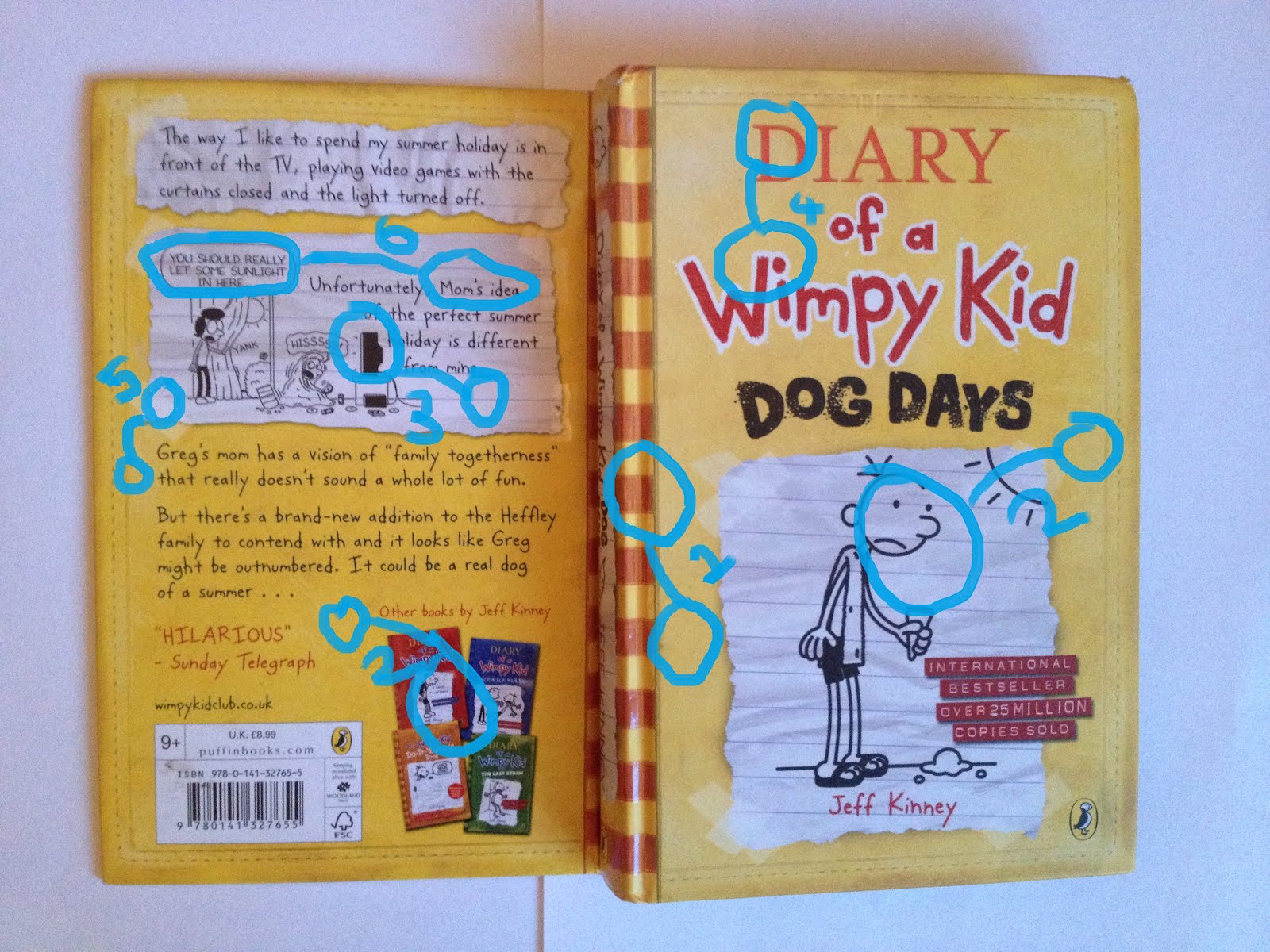
Above and below I have began to develop the spine and back page of the book cover. I wanted to link the back cover with the front cover as much as possible but using the same colour scheme, graphics, and the same style of illustration. I wanted to make sure that alignments were used to bring everything together in a professional way. For the front cover I decided to use the hierarchy and contrast in size of the imagery to create the eye catching effect that will catch a child's attention.

Here I have began to place my hand drawn images into little scenes in the corners of the cover. I have used the blue and green cover to give the effect of the sky and the grass and the keep a similar colour scheme. I played around and experimented placing the drawing in different places until I came up with this. Placing things behind and in front of other things to create a hierarchy. I then have slowly used the time to develop the cover to how I want it using my drafts and still looking at examples of other people's work for small ideas to ass on. I used the idea of adding a bow because i needed something to link the back and the front cover together when the book was closed other than the same colour scheme and alignments with the front cover.

C.R.A.P Analysis
C.R.A.P Analysis- Book Covers
Contrast
1) Patterned/Plain fill- The point of having patterns and plain fill creates more of an interesting design and gives the cover a contrast in patterns to attract the readers eye, it creates that small amount of difference and separates the front and the back effectively as well as still using the similar colour scheme.
2) Image/blank- Because this book uses a lot of white space and text adding the image weather it is hand drawn or a photograph makes that particular part stand out. Especially the parts that look like stuck on paper which creates an extra contrast of black and white imagery on full colour. it gives the book a hierarchy of where the eye is drawn to first.
3) Black on white- This is a very simple yet effective contrast because black stands out effectively on white because of the big change in brightness. The black is very dark which can create a silhouette image of a negative shape.
4)Serif/San-serif- Serif text on the cover of this book is quite a bigger contrast on this book than it usually would be on a computer designed book. This is because a lot of this book looks like it is hand made because of it being the diary of a boy. So the serif text stands out because it is the only typed looking text.
5) saturated/desaturated- On this book cover this is the only bit of desaturated text (on all the corners of the ripped up paper) to create a sticky tape effect. This is a very important bit of contrast because if it wasnt there the readers wouldn't get as much of the homemade diary feel that a young boy has made which leads us to what the book might be about.
6) Handwritten/computer font- The change in the font here represents who is talking. If it is the boy talking he is writing what is going on. However, to make sure the readers don't get confused the pictures in speech bubbles show what other people are saying in a different, less handwritten font.

Repetition
1) Pattern and colour- This repetition is an ongoing flow alone this spine to carry on with the repeated colour scheme of yellows and oranges. The pattern of stripes flows the colour well into the back of the page.
2) Stuck on paper effect- As well as creating contrast on the book cover this is also repeated onto the back cover which makes it look like some of the diary has been ripped out and placed onto the front.
3) Company logo- Shows the logo and relates each page to that company.
4) Border- This goes around the front and the back cover without any change to link all of it together as one.
5) Typography- As well as repetition of colour. separate pieces of text in red and the paragraphs on black. The handwritten look in the font is repeated throughout to really represent that the book is a diary.
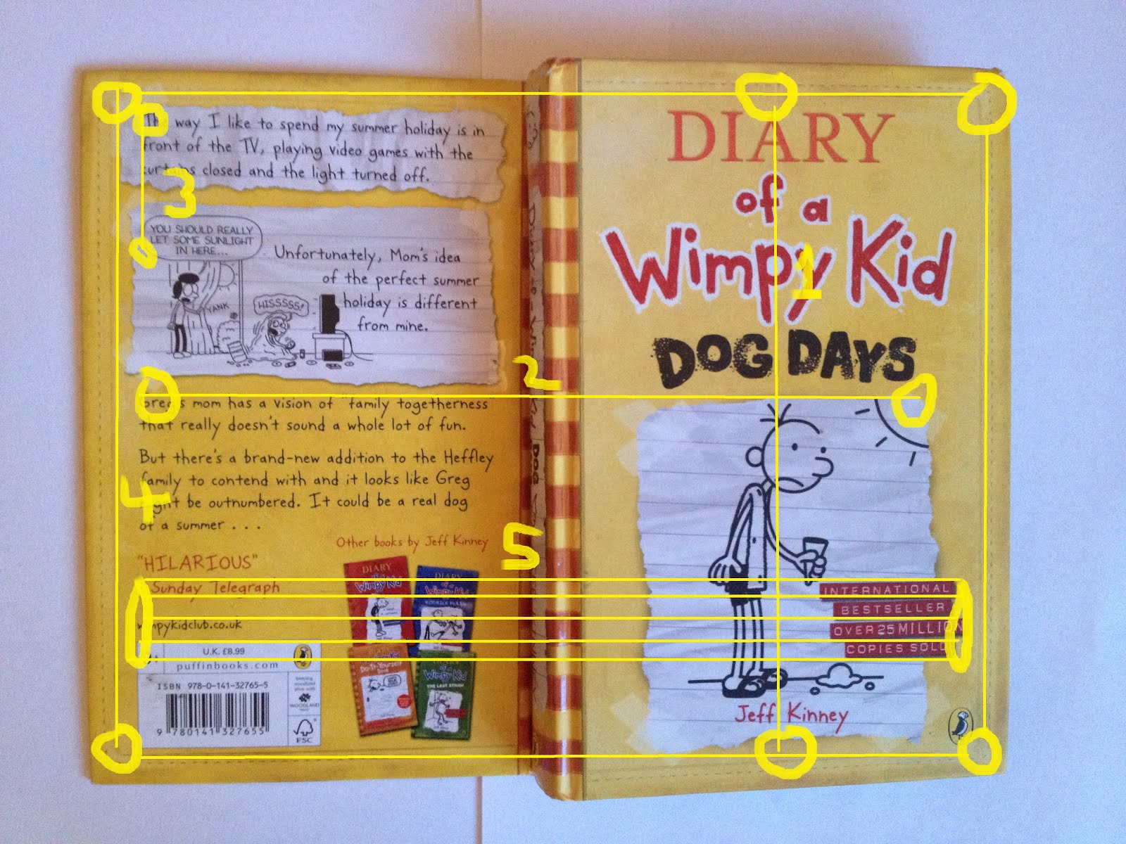
Alignment
1) Center alignment- This can be very risky for a graphic designer because it if it isn't done right it can look as if it has been just placed in the center with no real thought to it. However, it works really well here because it has been done properly at the same time as using effective contrasts in colour, fonts and imagery.
2) Front to back- Aligning things from the front page to the back page is really effective and is another good method to bring everything together. Its gives the cover a repetitive order.
3) Text- Even though these are clearly two different paragraphs and imagery have been made to line up together to relate each other together as well as again creating an order and format on the page.
4) Border- As well as the border bringing the cover into one with repetition it brings everything together with an alignment of straight lines to form a rectangular shape. everything that is going on is within this box.
5) Front to back- Again this is a few alignments from the front page to the back however, the are a lot less obvious because they are much smaller but still effective and making sure that contents aren't just placed randomly on the pages.
Proximity
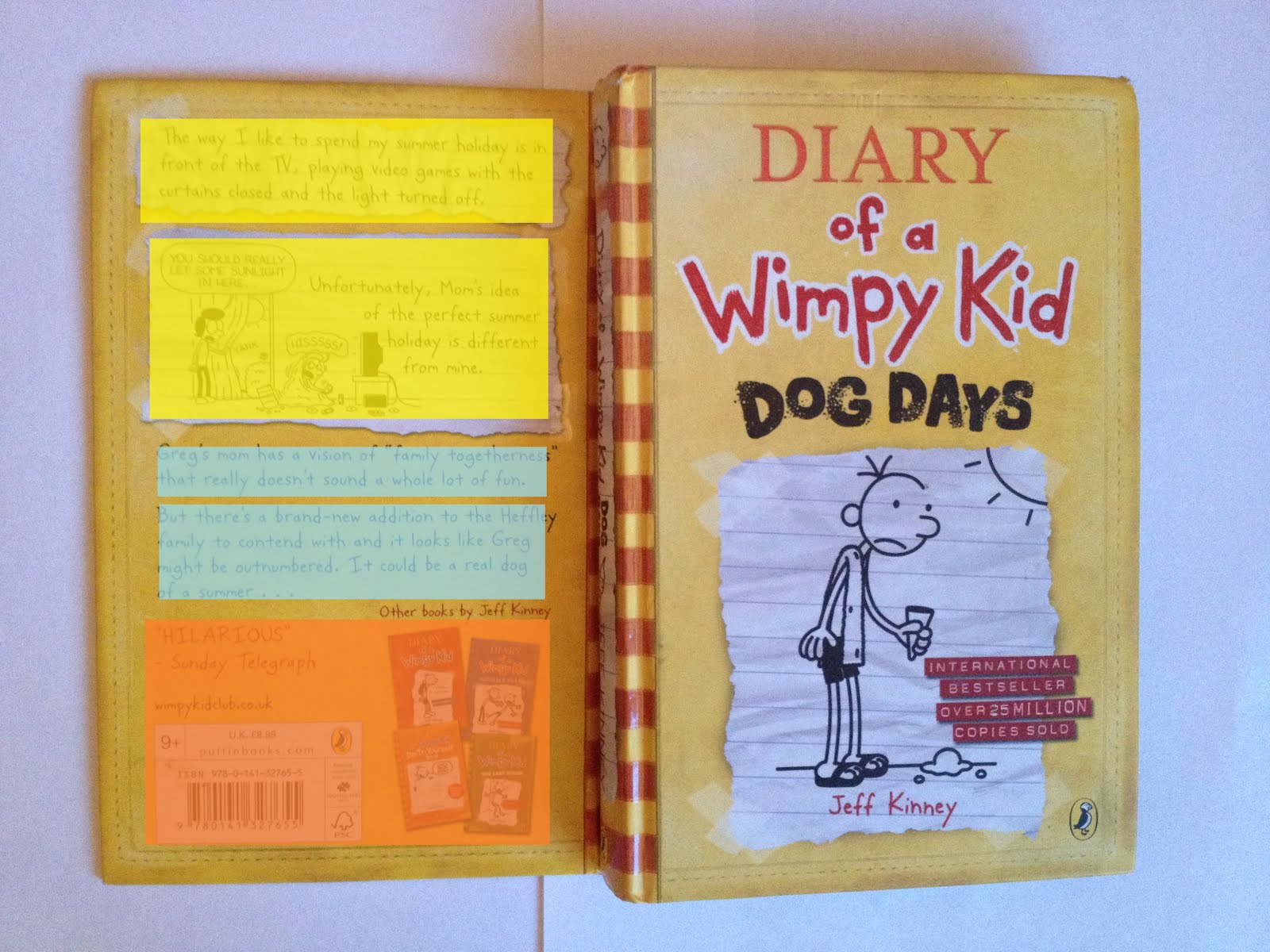
Yellow- Parts from the diary
Blue- Blurb
Orange- Information and reviews
Unlike the front cover the back cover has an order of proximity to separate all of the information into recognisable chunks to make is easy for the reader to find the information about the book that they are looking for.
Monday, 24 March 2014
Tuesday, 18 March 2014
Final Drafting- Front Cover


This Draft is more poetic to the others. It does it its own way represent alice in wonderland by using the roses and the heart which do feature in the book. And i have used the tangled lines to represent the adventures and complications that Alice goes through during the book.
Wednesday, 12 March 2014
Typography Design

After looking at other fonts and experimenting with styles I have come up with this typography to maybe use on my book cover. I call it 'Woodland Fall'. I have tried my best to create a font that shows floral, woodland effect. I have gone for a branch effect so the letters look like tree branches just beginning to blossom.


This is my mood board to develop ideas for my own typography. When i have been looking though pictures and ideas i have been looking at the outdoors and adventures/ exploring. I ideas in mind for the final piece using these themes all related with Alice In Wonderland and I am going to develop these ideas to develop a typography font that I could possibly use with my final Book Cover.
Friday, 7 March 2014


Tuesday, 4 March 2014


Monday, 3 March 2014
Copy and Emulation
Lucy Cousins- Maisy Illustration

Below I have done copy of Lucy cousins Illustration


Above is my Emulation of Lucy cousins Illustrations. I have used a think black permanent marker to draw out the picture (same as the copy) and i then scanned it into photoshop adding colour. Looking at Lucy cousins work she only seems to use a very simple colour palette which I have done as well. This works really well with children's books because colourful and simplicity is what a child is drawn to. This is defiantly a stele i would consider using for my book cover.
Simon James Illustration


Above is my emulation. In this picture i have included things that are the same subject matter as the book i am doing as my own cover design. I have again used water colours and pen.
Monday, 24 February 2014


Saturday, 22 February 2014
Hand Drawn Images


Above i have experimented with watercolours using things from my subject matter. i really like the effect of the water colour it created a soft, imaginative look but also would present the cover to look slightly mess but in a neat and effective way.

This is a quick experiment i have done using pen and a 'scratching' effect to create a distance in the picture between the trees in the foreground and in the background.


Friday, 7 February 2014


Subscribe to:
Comments
(
Atom
)